Redefinding data visualization to end extreme poverty, decrease inequality, and fix climate change
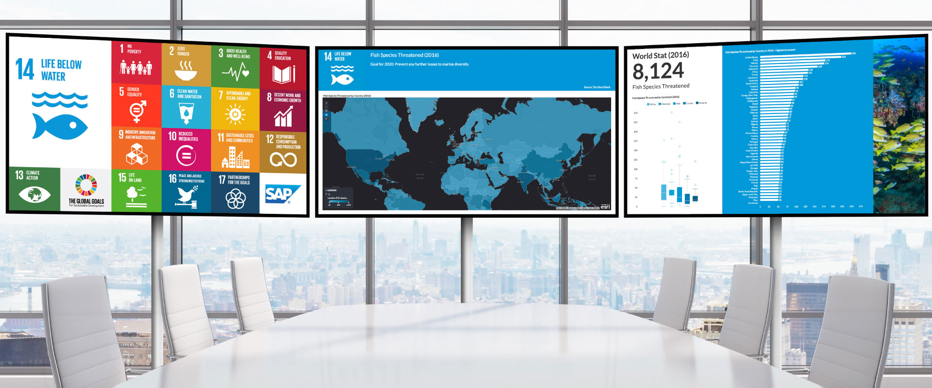
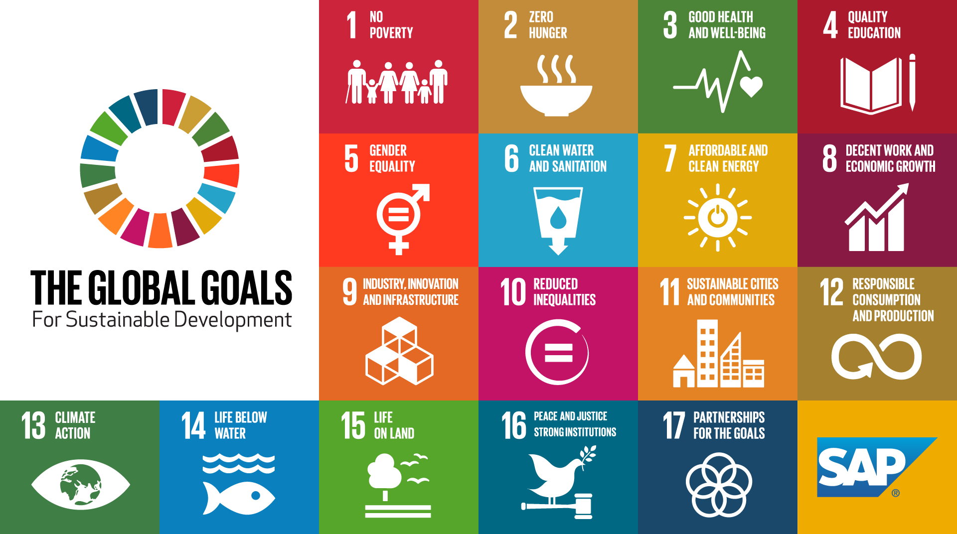
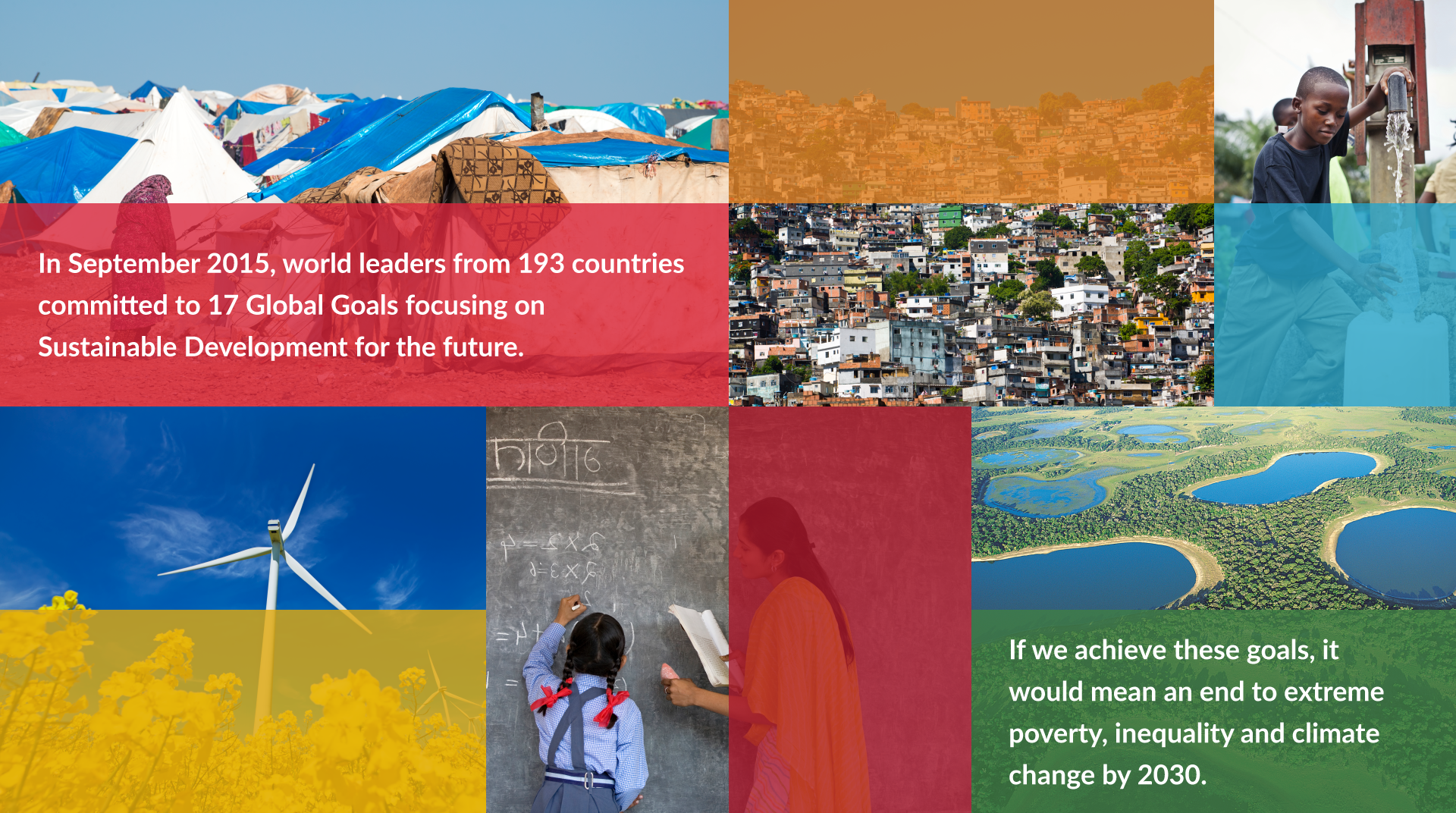
SAP collaborated with Global Partnership for Sustainable Development Data to create a Digital Boardroom that displays data of the 17 Global Goals launched by United Nations, which helps stakeholders to focus on areas that requires the most work and investment . The Global Goals aim to end extreme poverty, decrease inequality, and fix climate change by 2030.
View of the interface when goal 14 is selected.
Role: UX/UI Designer
Responsible for creating the visual style, composition, and structure of the product
Tools:
Information Architecture
Visual Design
Wireframing
Sketching
Understanding Data and Stakeholers
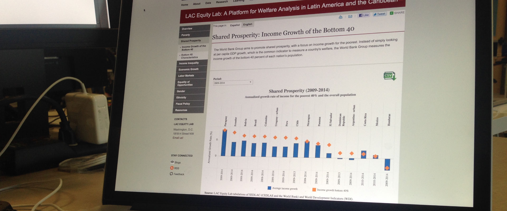
The stakeholers mentioned that could get overwhelmed by the amount of data available and needed a way to easily find and review data. I created a rough persona to capture how users would think when they are meeting reviewing data. Before I started sketching or creating mockups, I sat down with the Data Scientist to understand the various data available for each goal, which gave me a clear idea of the context.
Establishing Information hierarchy
Together with the data scientist, we wrote down all of the data on sticky notes and organized them to create information hierarchy based on level of importance and how users would approach the data. The result gave the data scientist a clear picture of what data were needed to be visualized for each goal and how I would approach designing the composition of each interface.
Creating Wireframes
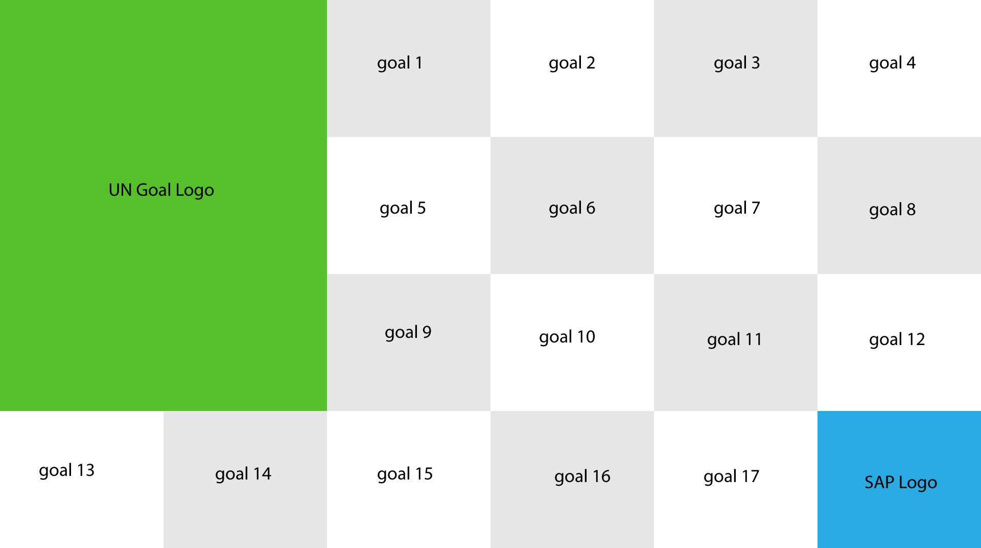
While the Data Scientist worked on visualizing the data, I focused on creating wireframes. I considered the hierarchy of the information of each goal throughout the design process because it determined where each data should be placed within the composition. Since the Digital Boardroom consisted of three big monitors, I also had to consider how the three screens would look together as a whole, not just for each individual screens. I created a grid structure of 4x6, so that it would create visual consistency across all interfaces.
Wireframe of the navigation screen on the left monitor.Wireframe of the landing screen for center monitor.
Final Product
We decided to move forward with the idea of keeping the left screen as the menu panel, so users could easily navigate between various goals. Data of each goals were displayed on the middle and right screens. Images and colored rectangular shapes in the background were added into the composition of the interfaces with data to create a cohesive look with the menu and landing screens.
Interface of the initial landing screens.
Outcome
I was informed that the United Nations were able to easily view the information they needed in meetings. SAP New York displayed this project in their office, so visitors and employees are able to view the current stats toward 2030 Global Goal.